We’ve been hard at work preparing a major update for both the Tuudo app and our entire brand. With this renewal, Tuudo will look and feel more modern — yet still familiar. Our goal is to create an even better user experience for students while offering new opportunities for educational institutions and business partners alike.
Tuudo’s new brand identity is now live, and the updated app will launch in November 2025.
Most Important Updates
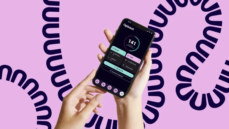
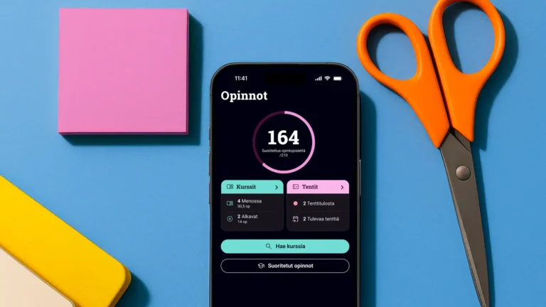
The new Tuudo app is fresher, clearer, and more user-friendly than ever before. We’ve paid special attention to usability, and in addition to the visual design, the backend system has been significantly improved.
All the same features and services you know from the old Tuudo will remain, but the layout has been enhanced to make in-app navigation smoother than ever. For example, employer and student benefit content is now more visible in the app’s new sub-menu.
And one of the most requested features is finally here — dark mode! In the new Tuudo, dark mode is the default, but users can easily switch to light mode if they prefer. Everyone can now choose the look that best suits their style.
A New Brand for a New Era
As the app gets a new look, the Tuudo brand is transforming as well. The rebranding began with a desire to clarify what Tuudo truly represents today and what we want to stand for. The new identity better reflects who we are — bold and agile with the strong “students first” -mentality. That energy that makes Tuudo, Tuudo.
The result is a fresh, vibrant, and colorful identity that perfectly complements the app’s new interface.
Logo and Recognition
Tuudo’s logo had remained unchanged since the very beginning — until now.
The familiar name stays, but the style has been updated into a modern, clear, and minimalist form. The merged T and U in the logo symbolize our role in connecting students and service providers.
Colors and Playfulness
Our new color palette is bright, friendly, and carries a touch of retro spirit. Tuudo is as diverse and colorful as student life itself — we embrace bold and sometimes surprising color combinations.
Playfulness also comes through in the new fonts and graphic elements, adding movement, joy, and a sense of spontaneity to the overall look.
Graphic Elements and Visual Storytelling
The central graphic element is a curved, flowing line inspired by the rhythm of the Tuudo name itself. It symbolizes the student’s journey — full of twists, insights, and continuous learning.
We know student life can be a balancing act. That’s why our new brand visuals feature playful arrangements where study tools are carefully balanced atop one another. These compositions convey a sense of motion and tension, while also reflecting students’ personalities and the many stories behind them.
What Does the Update Mean for Users and Partners?
For students, the new Tuudo offers a more engaging and seamless user experience. For educational institutions and business partners, it provides new and versatile ways to reach and communicate with students effectively.
Since day one, Tuudo has been the student’s best companion in navigating everyday studies. Now, we want to ensure that Tuudo’s visual identity truly reflects the value it provides.